The Complete Guide to Writing Product Copy That Sells Itself (+ 19 Examples to Get You Started Now)
Lianna Patch
Would you rather buy this candle…
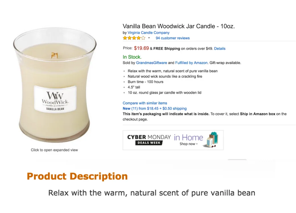
Or this candle?
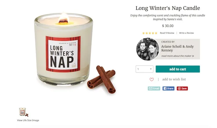
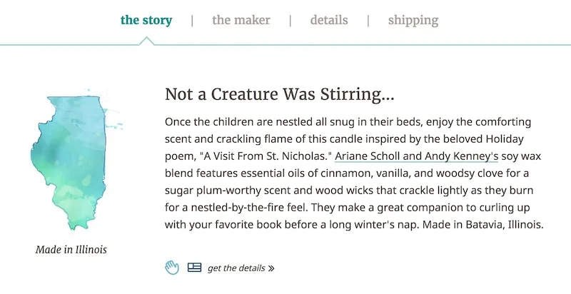
And which would you be willing to pay a bit more for?
They’re both candles. They have one job: make my house smell like the holidays.
But call me crazy if the second description doesn’t make me want to buy that candle right now. Even without seeing the thing.
If you’re still using the copy (actually, let’s call it what it is: text) that your manufacturer provides to sell your product — or you simply aren’t using unique product descriptions — I’m going to help you out today.
We’ll talk about a multitude of elements of an MVP product description, but first, a few ground rules:
The more complex the product, the more need you have for a detailed product description that adequately addresses fears, concerns, and buyer barriers.
Your product description exists #1 to inform, #2 to persuade.
Thou shalt always provide photos.
Let’s dive in.
Basic Elements of Product Descriptions
1. Include what it’s made of (aka materials)
Product description 101: Materials.
Tell me what the thing is made of, or in the case of a service business product, what it includes.
If I’m thinking about buying a shirt from you, I’d like to be sure that it’s made of cotton and not, say, bees.
If I’m thinking about buying a water bottle from you, I want to know that it doesn’t contain any BPA.
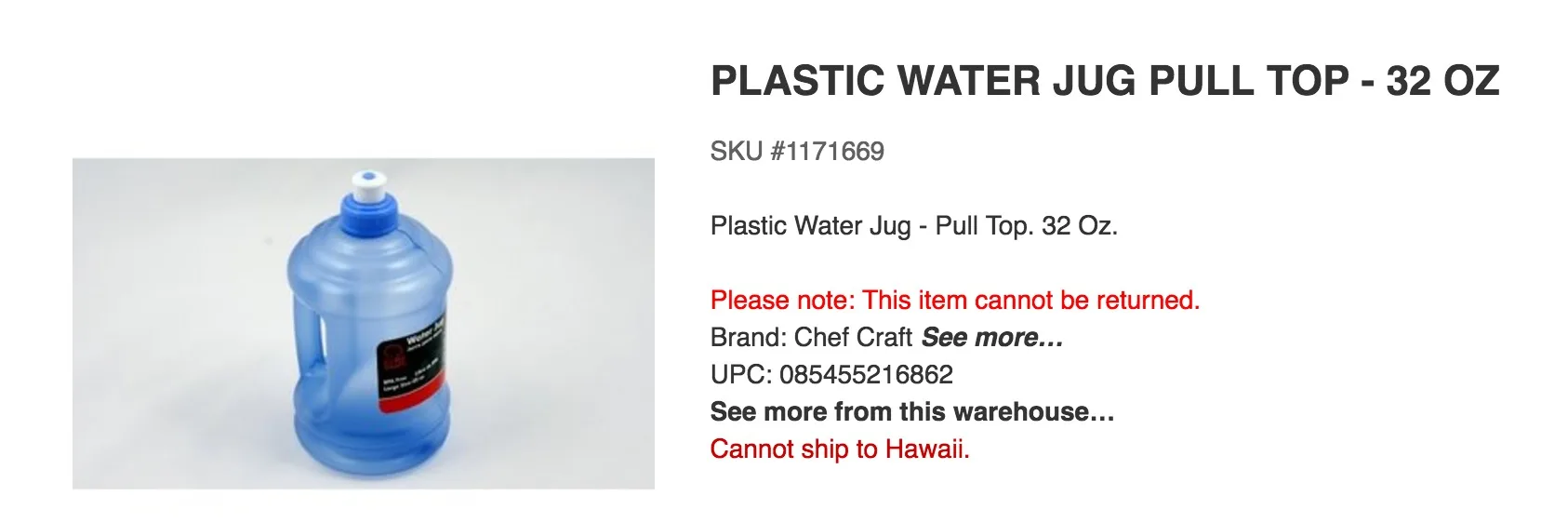
What’s it made of?
Booster Tip
Make sure to note if your product is made locally, or from organic or fair-trade materials. This is an easy way to build trust in your products’ quality.
2. List detailed measurements and dimensions
Ever bought furniture, such as a sofa on Craigslist, and realized an hour later that it didn’t fit inside your house?
Oh, that was just me? Cool.

It wasn’t this bad.
The dimensions of your physical retail products need to be clearly stated, so your prospect knows whether your company’s horsehair anoraks will fit him.
If you’re selling clothing, it’s not enough to have “small, medium, large” options, because sizing is all over the board these days.
You’ll need to include the measurements for each part of the body that your clothing touches, covers, or wraps.
Booster Tip
Better yet, link to an in-depth Sizing Guide like this one so measurement-inclined shoppers can buy your clothing confidently, and not get stuck in an uncomfortable situation.
3. Format like your reader is in a hurry
Formatting is just as important as the copy itself when it comes to product descriptions, because it’s what draws attention to (or away) from your description.
Let’s zip through some crucial formatting considerations: Photos, bullet points, paragraph breaks, buttons and mobile optimization.
Photos. Please invest in great photos. Please.
Not only is a picture worth 1,000 words, it could be worth 1,000 conversions.
So how can you make your products look fashion-magazine good without the fashion-mag editorial budget?
Your photos should be:
Shot in bright, natural light
High-resolution, so your readers can zoom in (Don’t be afraid of close-ups!)
Taken from multiple different angles
Booster Tip
If your product is small enough (eg. a pair of wireless headphones), take photos of someone actually using or holding it. Showing your product ON or NEAR a person helps make its dimensions apparent.
And, if your product is complicated, film a short video of it in use.
Use bolding, bullets and headers to make info scannable.
Just make things easy for your visitors, please.
Selective bolding and headers draw your reader’s eyes where you want them most
Bullets are an excellent way to group product specifications
And presenting information in small chunks, offset by icons, can help improve comprehension and retention
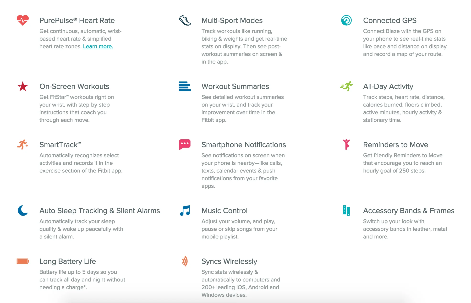
Chunk information so it’s easier to process, like Fitbit does.
Don’t overlook your button copy opportunities.
Your buttons probably say something like “Add to Cart” or “Buy Now.” And that copy probably serves you just fine most of the time.
But if you’re a chronic overachiever (AKA ecommerce optimizer), try testing button copy that speaks to what your user will get, instead of the action they need to take.
Example: Instead of button copy that reads, “Download Your Conversion Optimization Ebook Now,” test a button that reads “101 Ways to Make More Sales Right Now.”
Don’t forget to test click-trigger copy that tells people exactly what’ll happen when they click that gorgeous “Buy” button of yours.
This should be a given: make sure you’ve got a great mobile UX.
If your ecommerce site isn’t mobile-optimized, you’re not going to win with customers. And you’re not going to win with Google.
How to Write “I Must Have That” Product Description Copy
Let’s talk about everybody’s favorite thing: words.
Great product description copy makes it impossible for the reader not to be enticed.
And to entice your reader, you’ve got to be enticed by your own product.
Fall in love with it. Use it in non-indicated ways. Indulge in the details.
And then…
1. Write for the person who would LOVE this
Chances are, if you’re selling high-performance sportswear, you know who your target market is.
It’s the same whether you’re selling organic baby blankets, lactose-free ice cream, entomologist-quality butterfly collection kits, etc.
No matter what type of content you’re writing, you’re writing for ONE person, not a horde of strangers.
Be clear about that in your copy. Speak to that one specific prospect’s frustration, pain, and desires — that is persuasive copy.
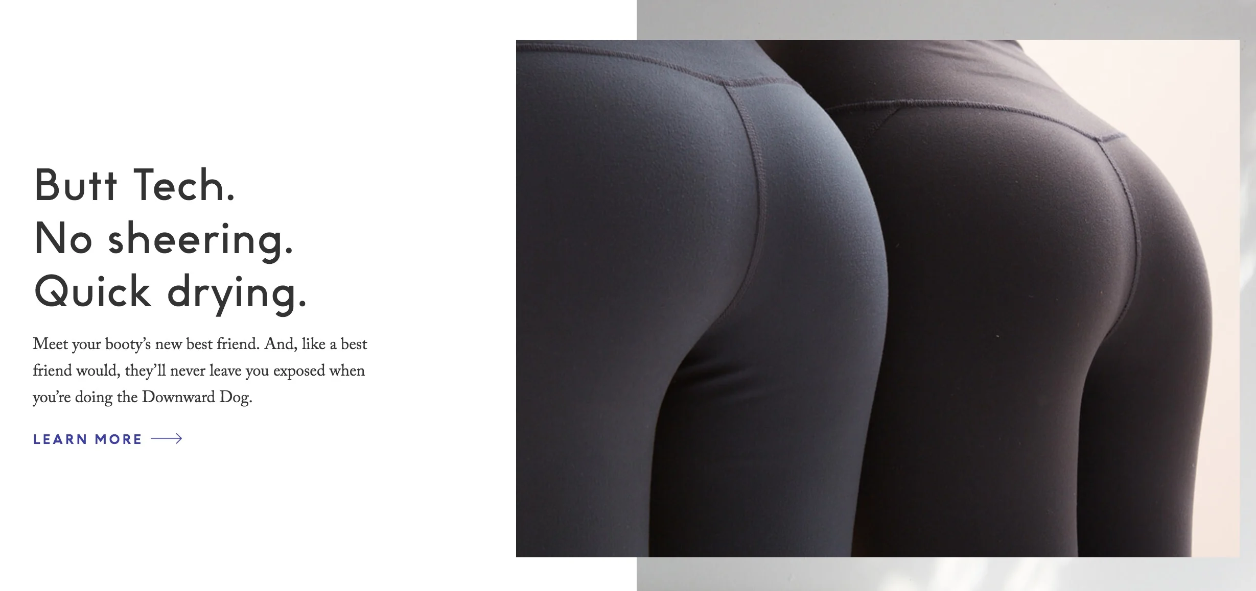
Opaqueness is a tantalizing promise when it comes to leggings.
When you use writing techniques for one person, that person feels like you understand them. So they click “Add to Cart.” And you get paid.
2. Paint a picture of how it feels to use your product
One shortcut to addressing your prospect’s deepest, darkest desires? Describe how it would look or feel for them to have your product in their hands, on their bodies, or in their mouths. Hit all the senses.
Luxury brands do a great job of painting a picture because they have to. When you’re selling a high-price luxury item, you’re not selling the item. You’re selling status, exclusivity, indulgence.
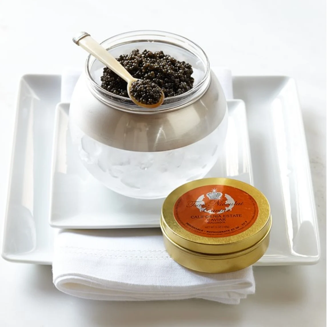
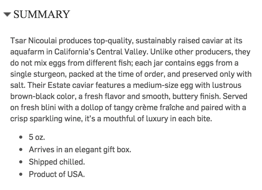
Straight from ONE SINGLE STURGEON to you and your beloved.
3. Keep your tone consistent with your brand
Continuing with the luxury brand theme: Kate Spade makes whimsical, highly conceptual purses that seem like a super-fun “why not?” purchase.
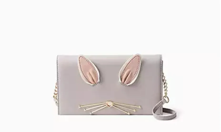
So cute!
The product and the brand are known for being droll but sophisticated, and the product description for this bunny purse nails that tricky tone balance.

Feel like buying me this purse?
4. Make them feel something
If there’s one surefire way to get someone to buy, it’s appealing to emotions.
Emotional appeal has long been a tactic in marketing and advertising, way before those horrific vintage ads aimed at making women feel worthless and unattractive for being “overweight” started appearing. You know the ones.
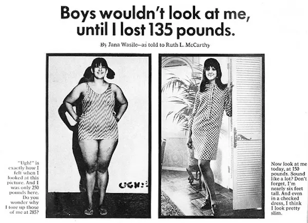
I bet this ad hit a lot of women right in the feels, and not in a good way.
Buffer published a great post about the science of emotion in marketing, and which emotions spur the reader to take action (share, buy, refuse).
Recommended Posts
How to Use Psychology & Sales Triggers to Double Your Conversion Rate
25 Conversion Rate Optimization Tips to Improve Conversions and Increase Revenue
Emotions don’t always make sense. They’re not always practical. Which is why they can be helpful for convincing a prospect to buy something they might not need, practically speaking.
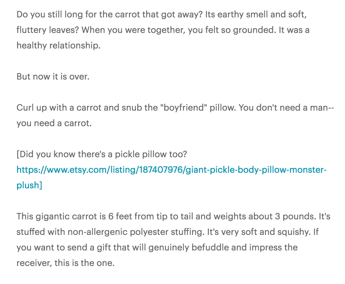
For example, I didn’t know I needed a Giant Carrot Body Pillow for Loneliness until I read this Etsy product description.
5. Connect features with benefits
Features are what your product is or includes, like “64G memory card” or “Reinforced stitching.”
Benefits are what your product does for your buyer, like “Never worry about running out of room for your vacation photos,” or “Durably constructed, so you can wear them for years.”
Booster Tip
Put this technique to use when you’re listing materials or construction, like Zappos:
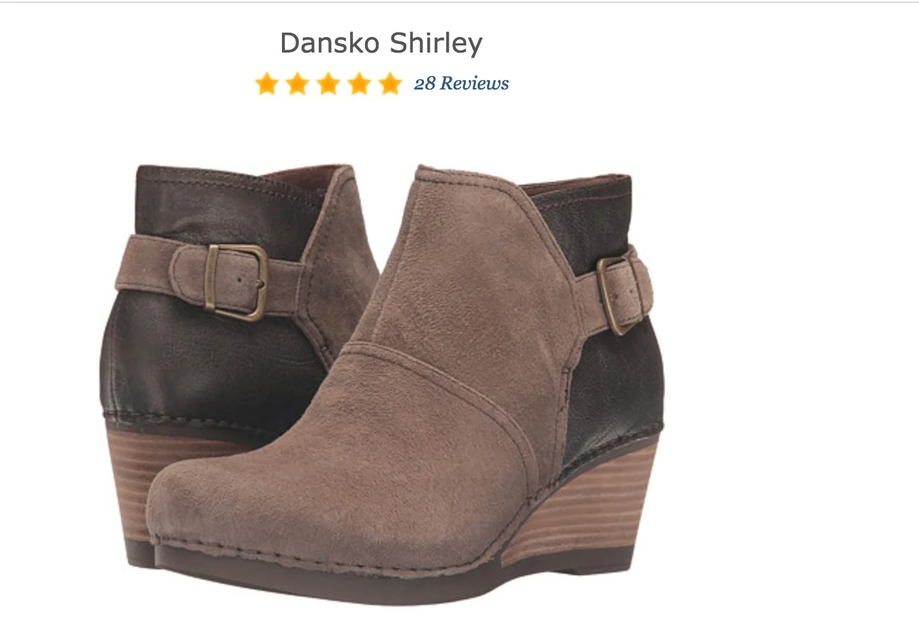

Combine features (side zipper) with benefits (easy on and off).
6. Banish cliches and empty phrases
Hey, ACUVUE, just wondering: What exactly is “crisp vision”?
Is it the same as being able to see? Oh, it is? Then why didn’t you just say that?
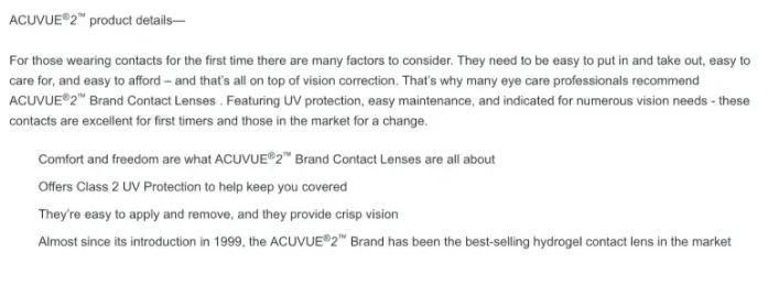
If you find yourself defaulting to meaningless filler descriptors like “leading-edge,” “first-class,” or my very favorite nothing-phrase, “high quality,” take a step back from your laptop.
Figure out what you’re actually trying to say when you default to lazy cliches. Then just say that thing instead.
7. Use sticky or sensory words
I don’t know about you, but I’d rather take a bite of “Velvety, buttery, melt-in-your-mouth chocolate mousse handmade with organic 60% cacao” than plain old “chocolate mousse.”
The first makes me think of this:

H/T Magic Bullet Blog nom nom nom
And the second makes me think of this:

Doing the photog a favor by not crediting this image.
Language that appeals to touch, taste, smell, and sound can light up an area of the brain known as the somatosensory cortex. That’s why a sentence like “The chilly water lapped at her ankles” has more impact than “She stuck her feet in the pool.”
Aim to make your prospects’ somatosensory cortices light up.
8. Use lively language
Alliteration is one of the easiest ways to make your product description copy shine.
Take a look at the last sentence of ModCloth’s description here: “Check out this dashing design in a host of other haute hues!”
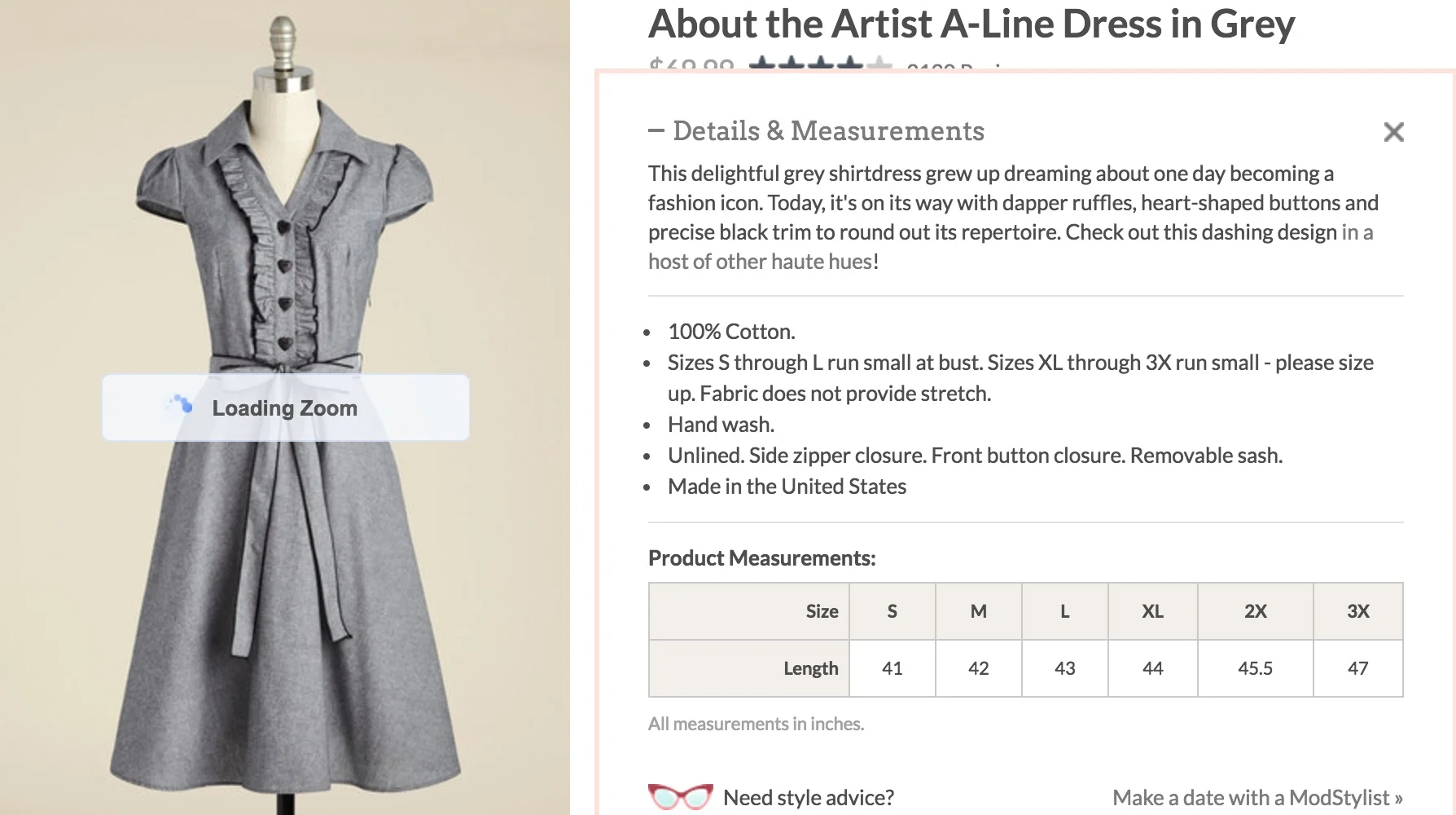
Just make sure you’re not unwittingly using unattractive sounds in your quest to alliterate, since the words you choose can actually evoke psychological associations in your reader’s mind.
Also, match your product to words that feel like the product. For example:
Describing a lemon-flavored soda? Stick to words that evoke lightness and bubbliness, like “sparkling,” “effervescent,” “bright,” “fizzy,” “fresh”… you get the point.
Describing a mahogany desk? Use words that evoke solidity and strength, like “sturdy,” “weighty,” “permanent,” “substantial,” “reliable,” etc.
As much as I love puns, use them with caution. You never want to confuse your reader about what your product actually includes.
From “I Must Have That” to “I Must Have That Right Now”
1. Create a sense of urgency
People hate to miss out on something they want — and when they want something, they want it now.
Urgency and scarcity tactics play on those tendencies, triggering FOMO in shoppers and pushing them toward purchasing.
Amazon has incorporated urgency into its product pages for a while now, positioning a seemingly innocuous bolded “Want it tomorrow?” and countdown timer near the “Add to Cart” button.

By tomorrow, you could be an intrepid backpacker.
And if you’re super worried that Spencer’s Gifts will run out of Silver Maiden Mother Crone Chalices, you’ll be swayed by the “Hurry! Only 9 left in stock!” note on the product page.
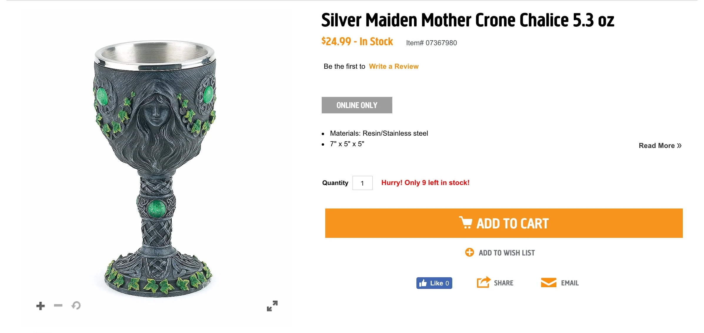
2. Stick some social proof on there
“Social proof” shows shoppers they’re not the first to consider buying, and that they’re not making a bad decision if they do choose to buy.
Like the IRS, social proof takes tons of different forms:
Starred ratings
Reviews
Testimonials
Client logos
Case studies
Certification badges
Press/publicity
If you’ve ever clicked on a product with no sales, seen “Be the first to buy!,” and bounced, it’s at least partially because that page lacked social proof.
Seals, badges, and certifications are effective types of social proof. Here, Patagonia’s “Editor’s Choice” seal helps novice gear-buyers understand they’re making a solid choice.
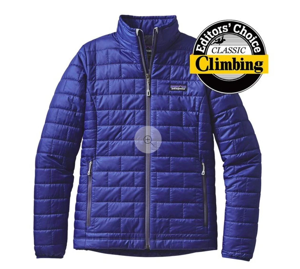
You’re probably already using social proof like reviews and ratings on your ecommerce site.
But have you considered using those reviews to make your product descriptions more compelling?
Mine your reviews, both positive and negative, and use them to directly address fears and unexpected benefits in your product description.
If a reviewer says, “I was afraid this drone wouldn’t be powerful enough to reach my neighbor’s yard,” add something like this to your description: “Afraid it won’t be powerful enough? Its rechargeable lithium ion battery means you can fly clear across your whole neighborhood – as many times as you want!”
3. Update product descriptions when it’s topical
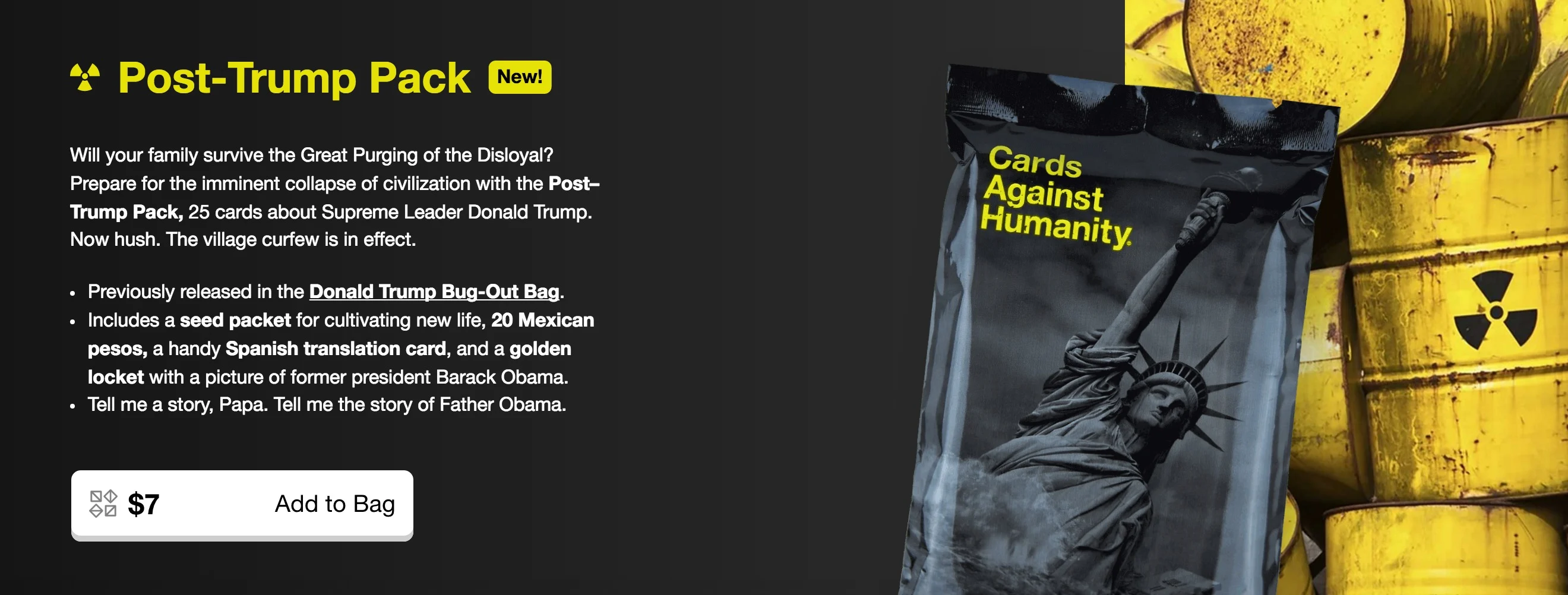
Check out the last two bullet points in Cards Against Humanity’s latest product description iteration:
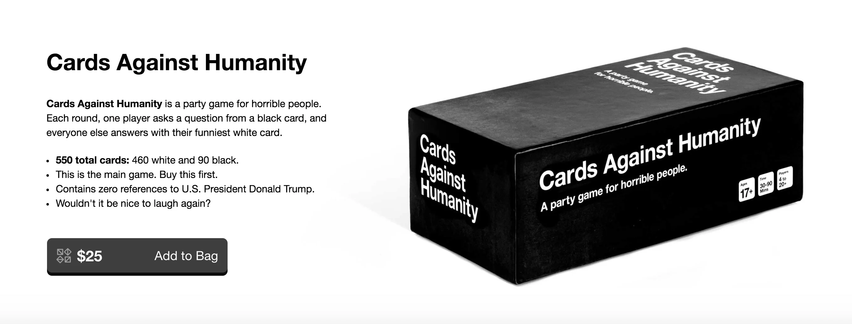
Didn’t expect to see an election reference on a product page, did you?
You could even build a mini campaign around current events, which CAH also did:
4. Feature the makers
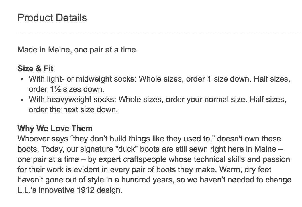
Make your product feel personal by mentioning or even showcasing the people who actually make the thing.
L.L. Bean’s got it down:
Remember the candle from the beginning of this post? Here’s how Uncommon Goods highlights the makers:

5. Put a bow on it with security features
Security features, like SSL (Secure Socket Layer) encryption and antivirus software “trust seals,” can sometimes help assuage prospects’ fear of having their information stolen.

If this lock ever goes missing from PayPal.com, there’s a biiiiig problem.
But test wisely, because while SSL encryption can affirm trust and even affect your rank in Google, displaying trust seals might introduce fear where there was none before — potentially decreasing your conversions.
When Are Product Descriptions Not Important?
Trick question. They’re always important.
But sometimes, they’re a little less important — so you might want to make them shorter.
Detailed product descriptions are a teensy bit less important in these cases:
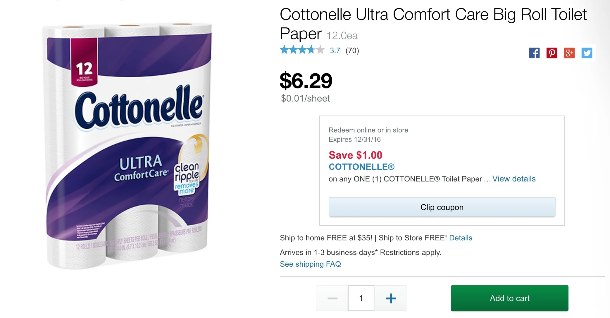
When you know someone needs something — so they’re probably going to buy it anyway. I’m guessing that’s why this Walgreens toilet paper product page is so boring.
When you’ve already done most of the work of winning the sale. For example, if you’ve nurtured a lead through email, and you’ve gotten them to click through to the product page, a long-ass description might be distracting. Which could hurt your conversions.
Well, we did it. We got to the end of the post. Let your family know you’re still alive.
One last thing: With every idea we’ve talked about here, test, test, and test again!
Then come back here and tell me about your test results (or hit me up on Twitter).
I’ll just be here, sniffing my candle…

Lianna is the owner of Punchline Conversion Copywriting and the Copy Director at SNAP Copy. You can sign up for her free email copywriting series, Just The Tips.
