Ecommerce UX: What It Takes To Create The Best User Experience For Your Online Store
Charles Richard


Ecommerce UX: What It Takes To Create The Best User Experience For Your Online Store
Get The Print Version
Tired of scrolling? Download a PDF version for easier offline reading and sharing with coworkers.
A link to download the PDF will arrive in your inbox shortly.
Ecommerce trends continue changing in a breeze. Some trends may only be passing fads, while others may act as a seismic shift across the industry. Online or mobile shopping falls into the latter category.
Today, customers have become more picky and more discerning than ever. According to Adobe, 38% of online shoppers will leave a website if they find the design to be unattractive. And that’s the reason why businesses are working hard to come up with a website that is clean and easy to navigate in order to make the purchasing process as intuitive as possible.
What is Ecommerce User Experience?
In layman’s terms, the core idea of a typical user experience (UX) design is to get inside the head of your end user and figure out what will provide them a simple, logical, and enjoyable shopping experience.
Ecommerce user experience, however, is all about the perception a user has after interacting with your website — whether it be positive or negative.
Have you wondered why around 76 out of every 100 of your visitors end up abandoning their cart? It’s simple — they aren’t impressed at all.
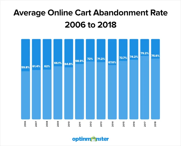
Image Source: Optinmonster
Creating a great impression is very important whether it’s for the first, second or even the hundredth.
Imagine yourself walking into a brick and mortar store. You are looking for something that’s hard to locate. When you seek assistance, you find a customer service associate is busy playing a game or texting on their phone.
How would you feel? Annoyed? Disheartened? You’d probably just walk out! These feelings also apply for online businesses. The rise in cart abandonment leads to a staggering amount of revenue lost.
Let’s illustrate this with an example:
Amazon.com: The Godfather of Ecommerce. The million dollar venture is highly popular for their A/B testing methods of their shopping cart. Even after creating a notoriously-cluttered website, the company keeps making improvements over and over.
What did they actually do?
First, they focused on top billing. From price to savings, customer reviews and ratings and even product availability, Amazon nails it down when it comes to giving the most crucial information right off the bat.
Next, they emphasized the “buy button” by setting it on a different color background. Apart from this, Amazon started to offer free shipping — one of the most compelling reasons for users to shop. Amazon completely solved the instant gratification problem that plagues online shopping.
Ecommerce UX Drives Conversion
According to the CEO of Amazon, Jeff Bezos, if you build a great experience, customers tell each other about that. Word of mouth is very powerful.
UX design plays a pivotal role in the success or failure of any ecommerce activity, and it is not just limited to aesthetics.
Right from thorough logic and transitions to simple and clear micro-interactions, fast feedback from the system, attractive product presentation, easy payment flow and a bunch of intuitive features, every such single aspect can directly or indirectly affect your ecommerce game.
Some of the basic yet crucial factors you should take into account include:
Operational simplicity.
Design that’s not overshadowing the ecommerce site.
Product promotion.
Security of user’s data.
Appropriate visual elements such as menus and catalogs.
A bad user experience is like walking into a very messy and disorganized retail store.
And I am sure you want to make it easier, not harder, for customers to purchase your products. Want to avoid this? Let’s take a look at SkullCandy’s work.
Launched on BigCommerce, the popular site stands out among the competition with great color and product images. Detail pages showcase great product descriptions and product information as well. Whether it’s their product or music, corporate culture, the company certainly pushes its limits to a great extent.
While exploring the site, I had a great first impression and personally found that it offers ease and frictionless flow engaging the end user at every moment. Overall, the mobile ecommerce design is unmatched in delivering customer journey and engagement at a lightning speed.
How to Stay Ahead of User Expectations
“The key is to set realistic customer expectations and then not to just meet them but to exceed them — preferably in unexpected and helpful ways.” – Sir Richard Branson
Don’t let your competitors outmaneuver you by ignoring this valuable step for your business. Your competitors are just a Google search away, and switching brands for the next best thing is no big deal for your customers.
Moreover, in the present scenario, customers act as brand advocates who promote their products and services widely. So you need to complete some user research to identify their needs, meet or even exceed their expectations, and deliver the best experiences.
Down below you’ll find a few pointers to help you better connect with your customers in this age of endless possibilities.
1. Offer a convenient and seamless experience.
Does the phrase “seamless experience” raise your blood pressure? If so, relax as it’s not as tricky as it seems. All you have to do is take a one step back and focus on the desired outcome.
For example, if you already have a brick and mortar location make sure you integrate the experience from both channels. Try offering services where a user can easily return products purchased online to a retail store.
Anywhere you can save your customers time is an opportunity for your ecommerce business to win.
2. Users (including Google) demand speed.
“2 seconds is the threshold for e-commerce website acceptability. At Google, we aim for under a half second.” – Maile Ohye, Google
Consumers want to find what they’re looking for, and it has to be fast or they will switch. Page load speed time is something that even Google considers when they calculate your site’s ranking. According to several researchers, 9.6% of visitors will bounce off your page if the load speed is more than two seconds. Every customer has their own unique worth; this might create significant losses in terms of revenue.
Make sure your web pages load quickly along with all images.
Avoid high bounce rate; it’s awful for SEO.
3. Keep an updated and accurate website.
Do you think a robust website can last forever? Probably not! Even after being an established business leader, there are certain things you will have to cope with day in and day out; your website is one of those! Ecommerce stores aren’t meant to be just built – they are meant to be developed. Here I would like to mention specific pointers that must be taken into account:
Update in terms of design.
Have a responsive designed website.
Keep content fresh.
Customers needs information to be easily accessible, like if a product is in stock or how long it is going to take to ship, user reviews, etc. One of the major turn-offs for customers is when the product is first in stock, but later when they go to checkout, it’s actually sold out.
4. Provide the right info in an appealing way.
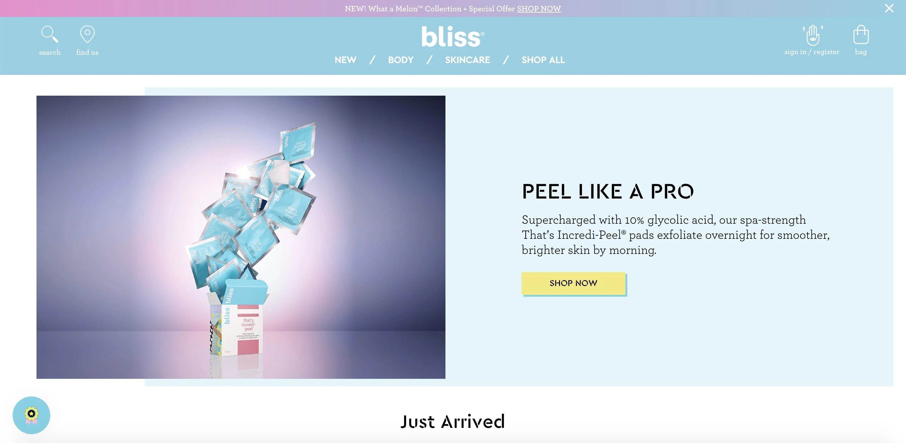
We, as humans, are always looking for answers. Make sure you answer all general questions about your business, your products, and your return policy on your website. Blissworld is the best example where you can see all the relevant stats such as description, skin type, size of a product. In fact, you can also land up on the product page while scrolling. Remember, surprise and delight has to be the desired outcome.
5. Ask for feedback proactively.
Customer feedback surveys are a must-do activity. Businesses should ask customers for their opinions before there’s an issue. You can add feedback forms to your website. This also shows that you care about what your end users think or feel.
Another example: Many websites offer live chat on their sites to greet web visitors as they browse the site. While browsing, any visitor can ask a question and end up chatting with an agent. This is what I call giving a personal touch!
All in all, whether it’s about winning new customers or driving loyalty, getting good returns in business, positioning of the brand, and customer experience are at the heart of everything.
And you know what the best part of doing all this is? It offers outcomes that are uniquely rewarding for many years to come.
7 Best Ecommerce User Experience Tips
1. Simplified primary navigation is a must.
Do you find the process of making a website that’s user-friendly and intuitive to be simple? Well, sorry to disappoint you but it’s not so.
Sticking a search bar somewhere and some clickable tabs or other CTA buttons on the home page is nothing but a waste of time. If you have defined/precise product groupings; there may be no need for a search field. It’s all about coming up with well-organized tabs and categories that lead to clearly established product pages. So what can be done?
Make the most of preconceived knowledge. It is the basic information or certain habits found in the visitors of your site as they enter your online store. Such information can be gained by either following your competitors or even from the real world experiences. In addition to this, keep uniformity with regards to navigation across all pages — including tabs, buttons, commands, and menus.
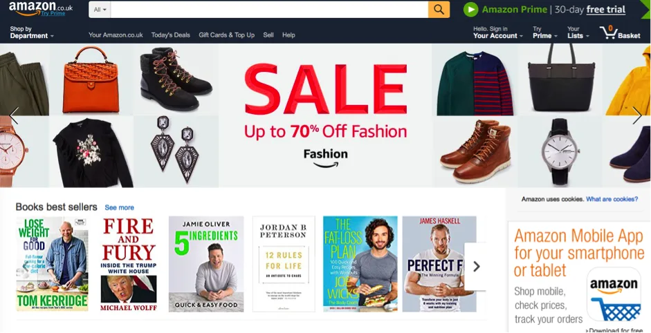
Back in 2016, Amazon used to offer lots of navigation options including the category list on the left of the page.
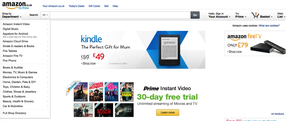
Today, top navigation options have been trimmed down and simplified. Check this out!
2. Make the checkout process and payments faster.
Have you given thought to making things as easy as possible for customers to pay? After all, this move leads to an increase in conversions and sales. Here are some pointers for making things easier for your customers to pay and increase sales.
Provide numerous payment methods (e.g. debit or credit card, Apple pay, PayPal)- According to reports, 56% of respondents expect a variety of payment options on the checkout page.
Do not force people to sign up; it’s a major conversion rate killer.
Have a seamless look and feel on your checkout page.
Offer a guest checkout experience.
Minimal form fields (seriously, the less the better!).
Stop sending them to other websites to pay.
Provide reassurances on security and privacy.
Add a clear call to action.
3. Use eye-catching elements to draw attention.
Nobody these days is interested in exploring those hamburger (or slide-in) menus — so get rid of them ASAP, especially for mobile UX. Using these types of menus hides key elements and makes tasks more difficult for the end user. Spotify dropped its hamburger menu last year, as did Next when it redesigned its site. So one can say, the tide seems to be turning.
Instead, focus on adding eye-catching elements to your website. Product imagery or other content media (e.g. videos, social content, or user generated content (UGC) can achieve this goal in many different creative ways. Study your customer base and understand what they are drawn to and capitalize on that.

New Layout of Spotify after removal of hamburger Menus Image Source: Macrumors.com
4. Take a note from minimalism.
Minimalism and maximalism are both design trends that are two poles apart — something like yin and yang. No matter how different they are; they are included in every known field of work starting from literature, art, and scientific research.
Digital media is no exception. Minimalist design is all about having a spotlight always on the product or a snippet of text that the business wants viewers to look at. More importantly, the homepage is more about the feel, high-quality experience or tone of the brand rather than exposition or information display.
5. Think of ways to get people back to your website.
You have worked hard to create a strong company website, but what’s next?
How do you attract more visitors?
How do you convert site visitors into customers?
Once they get in your ecommerce website, how do you keep them coming back?
Here are a few pointers emphasizing how to increase customer retention and turn every customer into a brand advocate for the long term.
Personalize your website — include customized landing pages, featured sections, voice search, or an email subscribe pop-up.
Highlight what’s new and popular with rich product details.
With the help of social media, give public recognition.
Engage users at regular intervals.
6. Show, don’t tell them.
If you show customers how awesome you are, they will fall in love with your business. Unfortunately, companies are focusing more on marketing instead of becoming customer-centric.
Let your customer speak for you! According to Customer Experience Maturity Monitor report, 81% of companies who provide great customer experiences and customer satisfaction do much better than their competitors.
Overall, it’s all about showcasing genuine customer outcomes. Ask them how their life or situation changed for the better after using your product or services. Highlight your best testimonials and customer positive reviews so that customer can able to believe your claim because a real time evidence is what matters today. By incorporating elements like pain points, solutions, and outcomes, you can provide a clear idea of what benefit your product brings to consumers. Here’s an example of How 99designs using their own customer testimonial page to showcase their customer reviews:

Image Source: 99designs
7. Customer service is still important, even online.
Can you tell me what the most valuable thing to a business is?
It’s the way they over-deliver in service to their end customers.
Of course, offering better customer service means you may find it hard to decrease the initial cost, but trust me — it will increase sales.
Still not convinced? Here I’ll give you a few reasons why customer service is more important than anything else in your business.
Provides value.
Builds trust.
At times service matters most — even more than price.
Creates brand awareness.
Reduces customer churn.
Increases Customer Lifetime Value (CLV) and Return on Investment (ROI).
Websites With the Best UX
User experience is about providing the best digital experience possible, so your customers continue to buy products from your ecommerce business. Further below I would like to shed some light on the best ecommerce website designs worth taking into account. User experience, branding consistency, mobile responsive and quick check out are just a few ways in which they excel. Take a look!
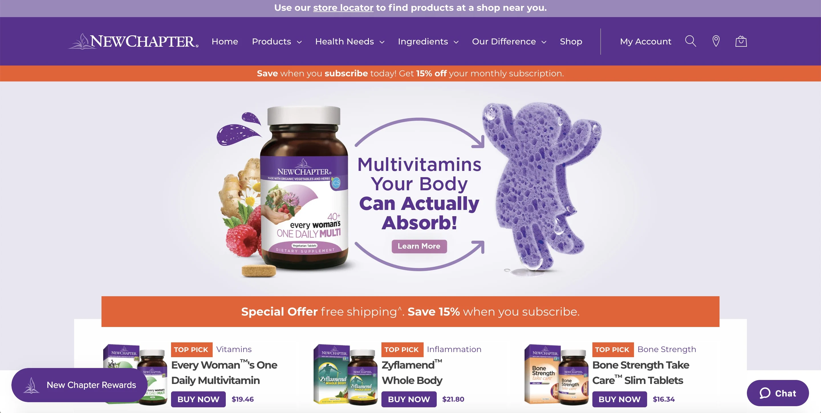
New Chapter
The P&G brand endeavours hard in mimicking digital native brand functionality especially in regards to innovation and customer engagement. New Chapter offers everything from quizzes to bundles featuring a personalized choose-your-own-adventure experience for its end customers.
Due to its extraordinary site design, conversion optimization seems to have increased from a launch state of approximately 0.4% to almost 2%.
Bliss
One of the most fun, youthful and energizing in-spa and product feel online channel I have ever seen. With the help of bright colors, fun graphics and even gifs, the site encourages you to explore, engage and buy instantly.
The Mountain
After finding initial success on Amazon, the site soon realized it’s worth to cultivate and engage with end users directly. Offering an easy way to navigate, a sense of urgency is built by including key coupons for certain customer segments. Customers click on ‘add to cart’ in no time.

Conclusion
No matter which industry you work for, you need to serve your customers with an easy-to-use, clean and attractive website.
After reading this post, you know how creating a good ecommerce UX transcends the boundaries of your website. All you have to do is strive hard by creating a comprehensive, strategic approach towards making the experience for your end users easier. Of course, every product and audience is different, so it’s important that you do research and track changes to find what works for you.
Also, keep a watchful eye for new trends and opportunities as most of these will be effortless to implement.
“Learning is a continuous process; it’s all about learning what works without jeopardizing your current revenue.”

Charles Richard works as a Business Analyst at Tatvasoft.co.uk, a software development company based in London. Apart from his daily job Charles likes to explore e-commerce trends and best practices. He has published authorship bylines in many major publications, including Quirks, Search Engine Watch, YourStory and more.
