The “About Us” Page Broken Down: What Content Should You Include?
Maura Monaghan

The “About Us” Page Broken Down: What Content Should You Include?
Get The Print Version
Tired of scrolling? Download a PDF version for easier offline reading and sharing with coworkers.
A link to download the PDF will arrive in your inbox shortly.
Picture this: you’re at a dinner party, and someone is talking your ear off about their new business. They can’t seem to describe it in words other than “innovative” and “great,” and you still have no idea what the company actually does.
If an ecommerce business were to bore you like this on their website, you wouldn’t even have to come up with an excuse to escape to the bathroom – you could just click off the page and be done. And that’s exactly what uninspired customers will do.
91% of organizations worldwide use content marketing, but few of those organizations are using it as effectively as they could. If there’s a single crucial place to make sure your brand’s content is top notch, it’s on your About Us page. For customers, the About Us page is a one-stop introduction to your business, and there are plenty of expectations to exceed.
What is an About Us Page?
An About Us page is an opportunity to introduce your company on your own terms. It’s where potential customers will go to find out why you’re passionate about your products – and why they should be, too.
A well-crafted About Us page is the key to building trust and loyalty with your customers.
86% of consumers say authenticity is important when choosing a brand to support, so it’s important to get this right.
But what exactly are the components of a successful About Us page?
Elements of an Ecommerce About Us Page
The first thing to keep in mind is that your About Us page is not just about you – it’s about what you can do for potential customers, and why you should be the one to do it. Therefore, you’ll want to make sure you provide some background on both your products and your team. You’ll also want to emphasize the core values that make your company unique.
Writing about your products or services is simple. If you’ve created your ecommerce business in response to a gap in the market or a pain point that you think people can relate to, then tell that story! People will be curious about the origins behind your ideas.
Writing about your team means showing customers that there are real, relatable people bringing your business to life. This is your chance to build likeability and trust, both of which go a long way in attracting new customers and retaining older ones.
Writing about your core values will show customers what your ecommerce business is all about. You can include these as a concise mission statement on your About Us page, and you can also use your values as a guide to organizing the rest of your content with a cohesive tone of voice.
Why Does an About Us Page Matter?
So far, we know that an About Us page is a huge opportunity to establish trust, loyalty, and likeability. Of course, these factors are great to have on every page of an ecommerce website – so why are they particularly important on the About Us page?
1. It’s the first stop for new customers.
In one survey from KoMarketing, 52% of respondents said the About Us page is the first thing they want to see when they land on a company’s website. This page is a customer’s first encounter with the people and story behind your products, so it’s important to make a strong first impression by emphasizing your values and telling your story.
2. It’s where you stand out from competitors.
When potential customers visit your website, they know you’re not the only option for whatever products or services you’re selling. So, why should they choose your company over everything else out there? The About Us page is where people look for your answer to this question.
11 Best Practices for an About Us Page
Distilling your company’s ethos into a single web page sounds daunting at first. But the task becomes a lot more manageable when you realize that the best person for the job is you – after all, who knows more about your company and its values than yourself?
In other words, you’re already equipped with all of the information you need to write an About Us page that will increase conversions and elevate your brand. I’m here to tell you how to make the most out of all of that information:
1. Tell a story.
In one study from Stanford, students were asked to give one-minute speeches containing three statistics and one story. Only 5% of listeners remembered a single statistic, while 63% remembered the stories. My point? Customers identify with the real-life people and origins behind brands. It doesn’t matter whether that story involves a generational family saga, or a simple lightbulb moment with a college roommate – just tell us what you’ve got!
2. Speak to your customers.
As much as customers want to hear the story of what makes your company unique, they also want to know how your company will help them. How will your products make their lives easier? Why should they choose your product ahead of everything else on the market?
In order to effectively speak to your customers, you also need to know your audience really well. As you write, it will help to construct a mini customer profile to refer to – one that goes beyond the basics of age, occupation, and location. Think about what your products can tell you about your customers. For example, someone selling upscale cutlery can infer that their customers like to cook. Sharing a favorite recipe on the About Us page would be a simple way to connect with that particular demographic.
3. Showcase your design.
94% of website credibility comes from web design, which means that a visually appealing About Us page is just as important as a well written one. Whether you hire a web designer or handle it yourself, you’ll want to outfit your page with a professional layout that draws attention to the text and images you’ve put on the screen.
Just don’t overdo it on any fancy design elements – the last thing you want is for customers to be distracted by a crowded page. Instead, utilize headings, subheadings, and white space to improve the user experience, and make your content super scannable to potential customers as they’re scrolling.
4. Show off your people.
We’ve already established that an About Us page should tell a story. And what drives a great story? Its characters! In other words, customers want to gain a sense of who you and your team members really are, so that they don’t feel like they’re buying from some faceless monolith.
It’s a great idea to include a team photo or individual headshots on your About Us page, along with some background from each team member about what drew him or her to the company. But don’t get carried away with industry talk, either. If your head of sales is also an amateur baker, share that, too! Everyone has interests outside of work, and your customers will appreciate the splash of color.
5. Gain your customers’ trust.
Crafting a compelling story and showing off your people are good starting points in gaining customers’ trust. But if you were deciding between two restaurants for dinner, which information would you trust more: a recommendation from a friend, or a sales pitch from one of said restaurants?
I’m guessing you’d go with the former, and the same applies to ecommerce businesses: 36% of internet users aged 25 to 34 use online reviews for brand and product research, because customers want social proof from other customers. Including a few testimonials on your About Us page is a concrete way to start building trust.
6. Have a call to action.
Calls to action, or CTAs, encourage visitors to take an identifiable next step after viewing your About Us page. They usually take the form of some brief linked text, like the “more details” buttons below:
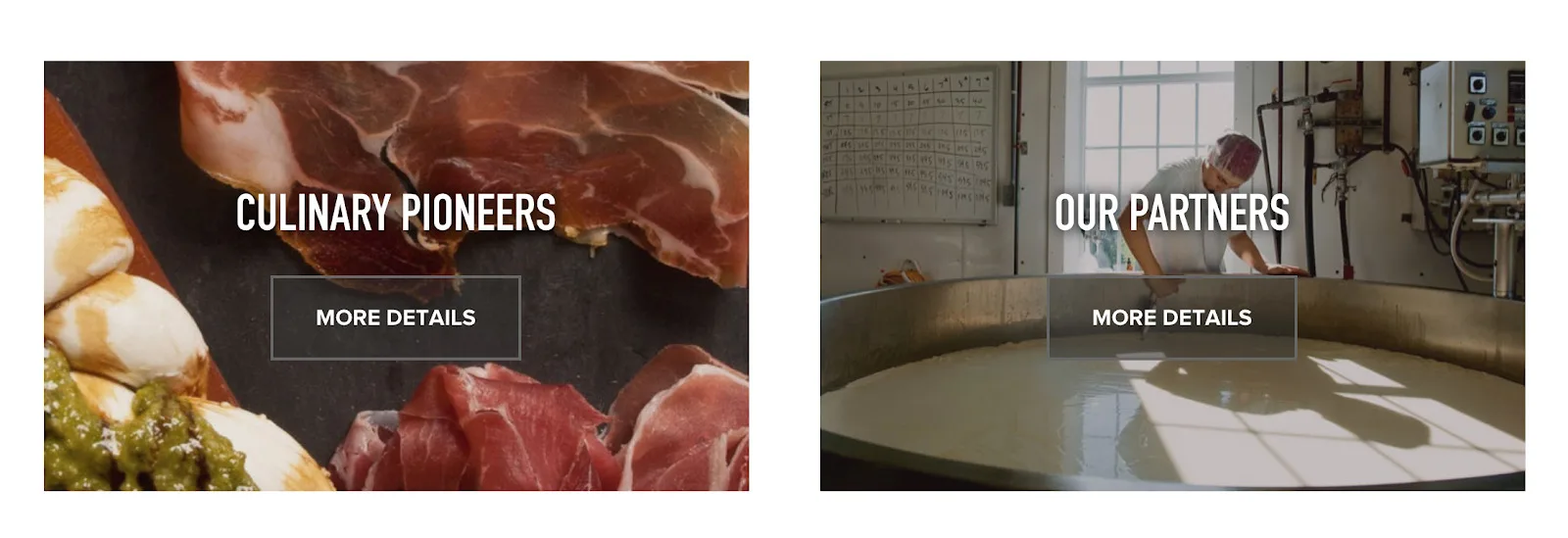
To create an effective CTA, think about what you want customers to do after visiting your About Us page. Remember that simple phrases like “Learn More” and “Buy Now” are easy to throw around, but aren’t always the most relevant. Lines like “Talk To Us” or “Get In Touch,” which then link to an email form or Contact page, can also be logical next steps to consider.
7. Make sure to align with your brand.
Consistent brand presentation can increase revenue by 33%, so it’s well worth it to identify some core values, and hone a specific tone of voice that will help build your brand online. Make sure the color scheme and fonts of your About Us page are also consistent with your general branding, and that it matches the theme of the rest of your website.
8. Integrate with social media.
An effective About Us page will make visitors want to engage with your brand and stay updated – which means this is the perfect place to plug your social media profiles. Whether you want to embed your Instagram feed directly on the page, or simply include a CTA that says “Follow Us On Twitter,” you should definitely take advantage of your About Us page as an opportunity to attract a larger following across platforms.
9. Include a contact method.
51% of people think that thorough contact information is the most important element missing from many company websites, and if ever there was a place to put it, the About Us page is a no-brainer. Whether you add an email form, a phone number, a mailing address, or some combination of the three, make sure you don’t leave interested customers without a way to get in touch.
10. Make it easy to read.
One quick way to make your About Us page easy to read is by including plenty of headings and subheadings. People quickly scanning the page will still be able to get the gist, and people actually reading the page will appreciate that the content is broken up into organized chunks.
You can also ensure your copy flows easily by reading it aloud. Hearing what you’ve written will alert you to any run-on sentences or awkward word choices that would have otherwise gone undetected!
11. Revise, revise, revise.
Finally, it’s important to present the best possible version of your brand on your About Us page. This means getting a second – and third, and fourth – set of eyes on the writing and layout before you hit “publish.”
And remember – revision doesn’t stop once the page is live! You should read through your About Us page at least once a month to ensure that the content is up-to-date.
What Not to Include in Your About Us Page
Just as there are definite components to include in your About Us page, there are also some elements to avoid. It’s easy to make the following mistakes by accident, so make sure you give your finished page a read-through with a critical eye!
1. A sales pitch.
Of course, it’s great to highlight your company’s strengths and USPs on your About Us page – after all, people want to know why they should choose your products over the competition. However, over-the-top self promotion and aggressive CTAs have never helped anyone gain trust from new customers. Using customer testimonials and highlighting individual accomplishments on your team will help you talk about your company’s assets without coming on too strong.
2. Fluff.
Customers come to your About Us page to find out who you are, what your values are, and how your products are going to help them. Given that only 28% of the words on an average web page are actually read, getting your message across as succinctly as possible is important.
In other words, don’t make your own job harder by being too wordy! It’s important to make the most of the short reader attention spans that you’re working with. The best way to cut down on fluff is to have someone else read your About Us page, and delete everything – I do mean everything – that doesn’t communicate a central element of your brand.
3. Too much text.
A high word count on your About Us page is bad for readers’ attention spans, and it also has a negative impact on the visual appeal of your web page.
38% of people will stop engaging with a website if the content or layout are unattractive, and a page cluttered with too much text definitely takes the cake in that category. As you format the text on your page, use images to help structure it, and remember that white space is also your friend. Avoid large walls of text that scroll for miles!
4. Too many pictures and videos.
Just as there’s such a thing as too much text, there’s also such a thing as too many pictures and videos! Media that provides deeper insight into your brand – like a team photo, video office tour, or branded infographic – is an asset to the page. But it’s important to avoid cluttering up your limited space with images that don’t need to be there.
10 Examples of Ecommerce About Us Pages
The best way to get inspiration for your own About Us page is to see what’s been done successfully before. The following ecommerce websites have all executed the 11 elements above with expertise worth studying:
1. Larq.
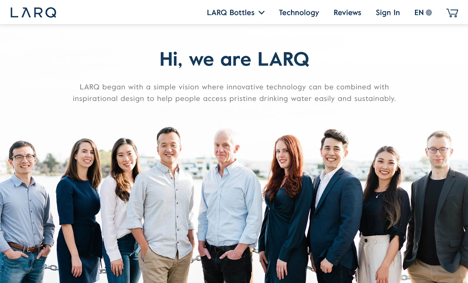
For a high-tech, sustainable water bottle manufacturer, Larq has crafted an About Us page with plenty of personal flair. Right away, the team photo helps us put (smiling!) faces to the brand, and it’s followed by a symmetrical arrangement of text and images that makes reading or scanning this page an easy feat.
2. Burrow.
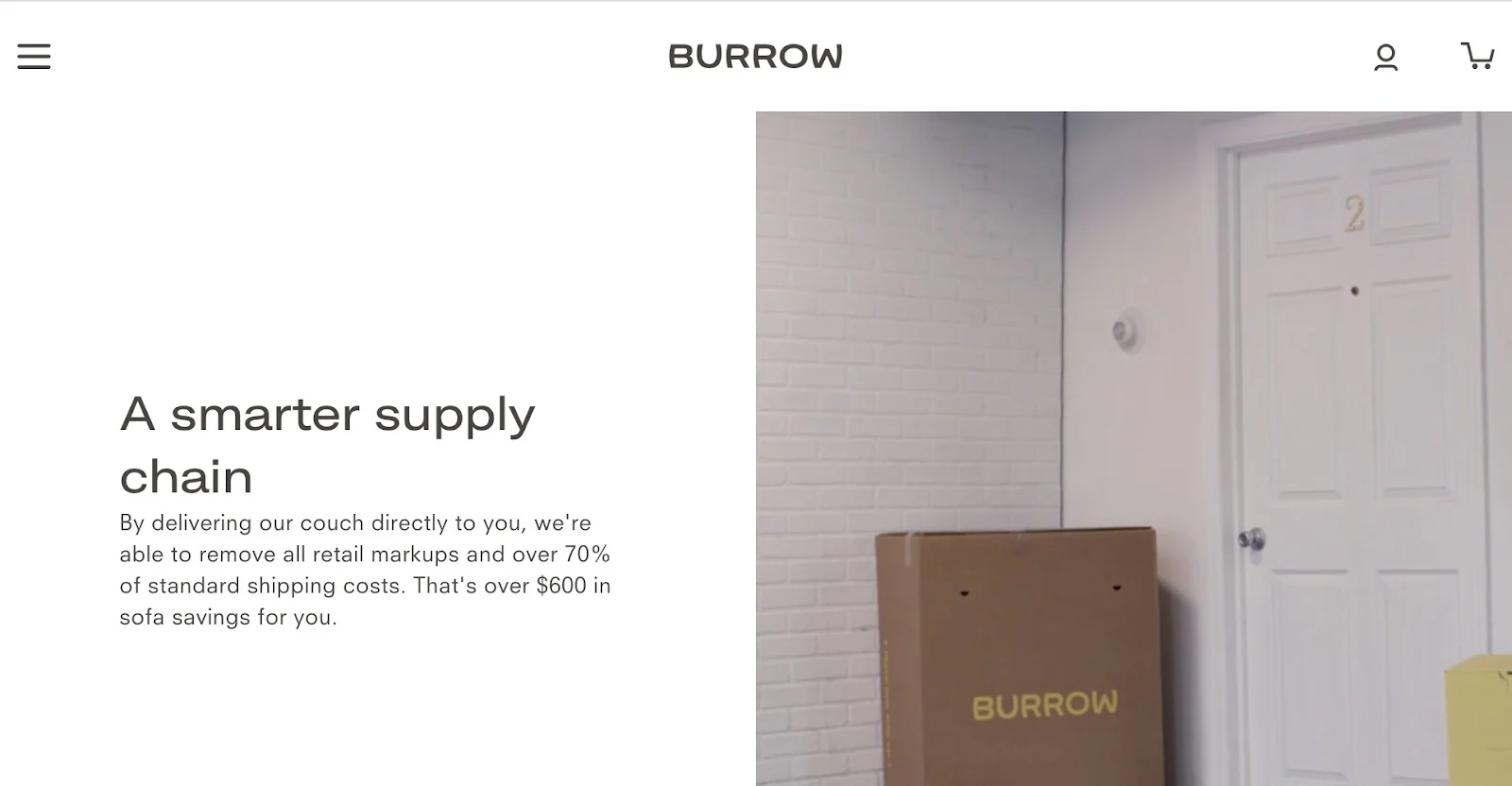
Luxury couch manufacturer Burrow has a simple About Us page that takes potential customers on an organized journey as they scroll down the page. Photo animations bring each section to life, but there’s plenty of white space to keep the moving pictures from becoming overwhelming – it’s a perfect balance.
3. Bliss.

This page from beauty supply company Bliss uses playful images that give us a feel for its products, plus stylish blocks of color that tell us as much about the company as the text does. In terms of knowing what your audience wants to see, it’s hard to do better than this.
4. Bon Bon Bon.

Detroit-based candy shop Bon Bon Bon offers a prime example of using your About Us page to tell a story. In fact, the page isn’t even titled “About Us.” Instead, it’s called “Bon Beginnings,” and it expertly breaks up large quantities of text with well-placed images and (minimal!) decorations.
5. Di Bruno Bros.
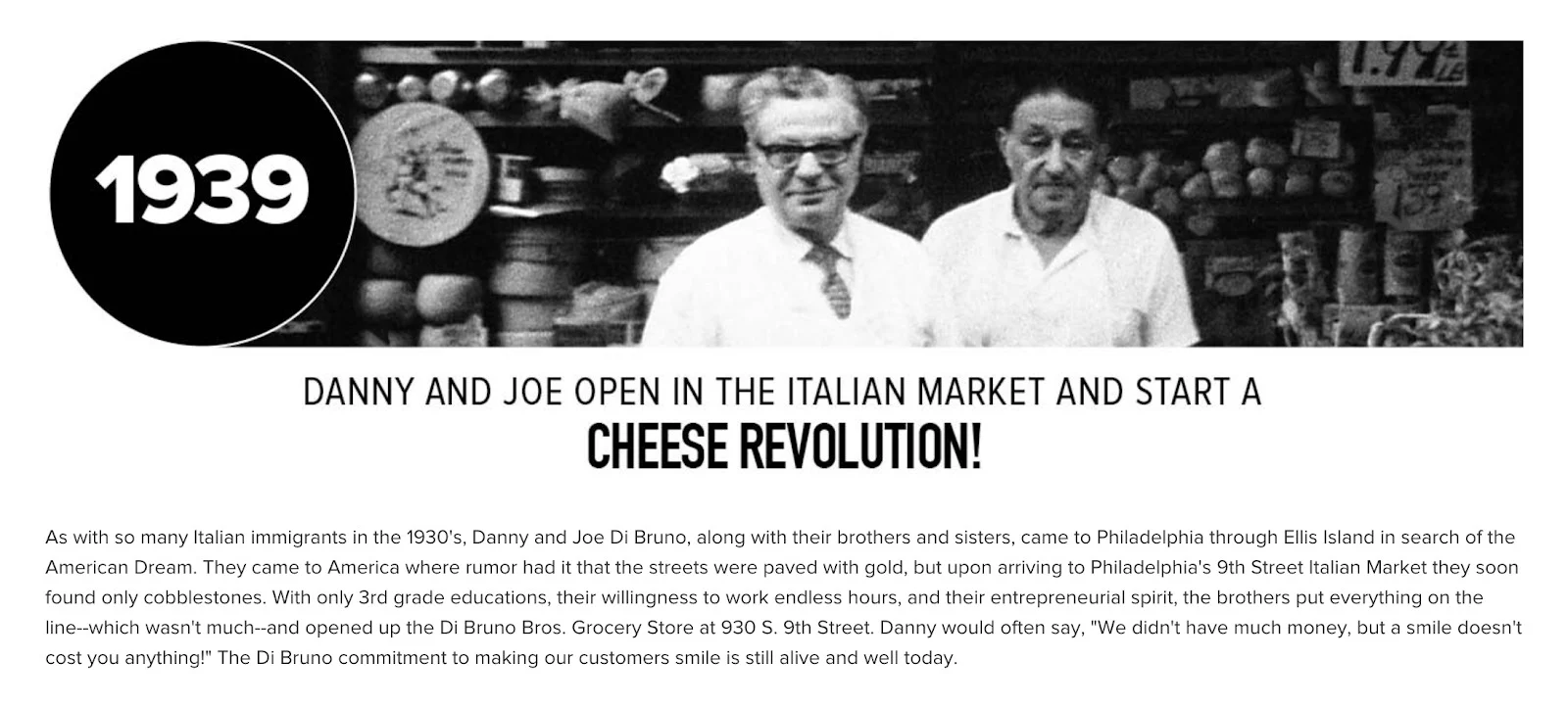
Di Bruno Bros. is a massive food retailer that began with two brothers back in the 1930s, who started a business to offer “the highest quality products, made with integrity.” This About Us page is a testament to those core values, and reading through the copy, it’s obvious that those ideas have successfully guided the structure of the whole page.
6. Natori.

I could highlight a lot of things about fashion company Natori’s About Us page – the well-crafted story, the abundance of white space – but my favorite element of this page is its simple social media integration. The interactive Instagram feed at the bottom of the page is a great way to show off a ton of products without clogging up the rest of the page with too many pictures, and the trendy photos give us even more insight into the brand’s ethos.
7. NaturallyCurly.
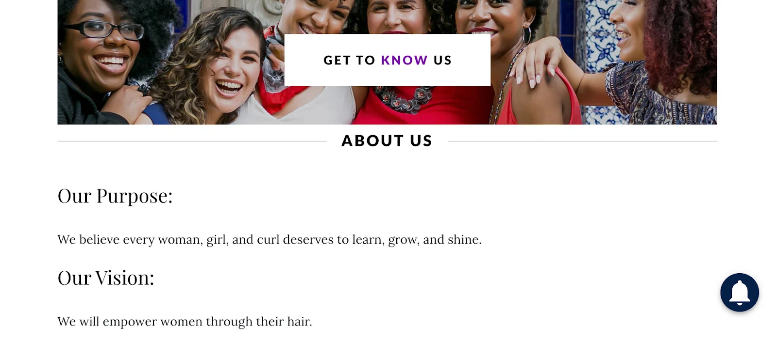
NaturallyCurly’s About Us page is an excellent example of aligning with your brand by emphasizing your core values. The page kicks off with a simply stated Purpose, Vision, Mission Statement, and Brand Manifesto. But as you can see, these sections are kept as brief as possible – in other words, there’s no fluff!
8. Solo Stove.
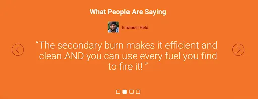
My favorite element of Solo Stove’s About Us page is its succinct customer reviews section, which you can find well-placed at the bottom of the page as social proof to supplement the brand story above it.
9. Kelty.
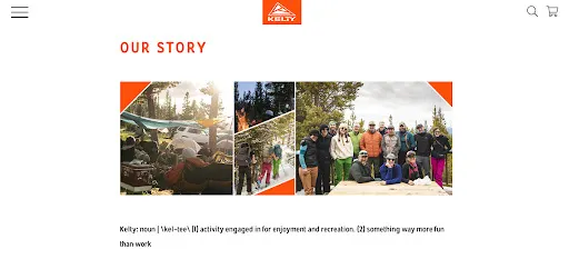
One read-through of Kelty’s About Us page shows that this outdoor gear manufacturer knows its customers really well – the copy is full of encouragement to get outside and play. Even better, the question of why customers need this product in particular is answered throughout with lines like “we build great gear that’s made to last, and inspire you to rediscover the joy of spontaneous play.”
10. Crown Wine and Spirits.

Crown Wine and Spirits makes textbook-perfect use of titles and headings to create an easy-to-read, scannable About Us page that works for both the dedicated reader and the casual scroller alike.
Conclusion
As you craft your own company’s About Us page, draw on the 11 examples above for ideas, but remember to let your own original story and products do most of the heavy lifting.
Think of the 11 best practices outlined here as a template waiting to be filled in with your brand’s personality. Some must-have elements, like contact details and a clean page layout, may not feel very inspired, but other elements require a unique brand identity in order to work.
Whether you’re using quotes from various team members, including an anecdote that you know your customers will relate to, or recalling your company’s humble beginnings, you can bring your own story to life in a way that will attract new customers while retaining old ones.

Maura Monaghan is a writer at Website Builder Expert, where she enjoys covering technical topics in a more accessible light. She specializes in web hosting and content marketing. In her free time, you can find her out searching for the perfect cup of coffee.
