Your website design influences 75% of your store’s credibility, and you have less than one second to leave a first impression. That means perception is everything, and your customer’s perception is a reality that matters.
Ecommerce website design involves creating and launching a virtual store to sell products. We’re not talking about listing your items on a third-party online marketplace like eBay. This is your store, and you have creative control.
While website design isn’t the only thing customers look for, integrating it with social media marketing, digital campaigns and search engine optimization (SEO) will provide a superior user experience that increases traffic to your store.
Ecommerce Website Design Best Practices to Follow
Your ecommerce store design will depend on the needs of your customers. Still, some standards are relevant across industries.
Here are a few elements that are essential to every ecommerce site design:
Design for user experience.
Design isn’t only about the appearance of your store but how it makes your customers feel. Your ecommerce business must provide a unique experience that creates an emotional tether between your buyers and your products. You want customers to envision your product in their daily life and make it easy for them to justify their spending habits.
Beautiful photos and bright colors are lovely, but prioritizing the customer experience has the most significant impact. After a pleasant user experience, customers are more likely to complete their orders at a 400% higher conversion rate and become frequent shoppers.
A customer-centric design has an organic structure and flow that is consistent and easy to use for buyers across demographics. Simplify your site navigation and include a smart search feature to help customers quickly find their desired product.
Walk through your website to gain insight from the customer’s perspective. How easy is it to search for products? Is it clear which steps customers should take to purchase a product?
Match brand identity.
Your ecommerce website is more than a store; it’s a brand. A brand-first approach to design ensures that your store reflects a value proposition that connects to leads, builds loyalty and establishes your website as a standout amongst competitors.
Your brand emphasizes who you are as an online business, represents your company culture and aligns with your product quality.
A successful design communicates your brand story through unified aesthetics and messaging. Determine the types of product photos, fonts, iconography and color schemes that resonate with your customers.
Be consistent with your design. Page layouts and features may change to accommodate new products, information and navigation sequences. But your color palette, menu and logo placement, patterns and fonts should all reflect a cohesive narrative.
Stay up-to-date with trends.
Twenty years ago, ecommerce stores were intermediary tools for connecting customers to a sales team. Today, ecommerce web designs continue to evolve with the advancements in technology. Emerging trends include interactive layouts, dynamic pages and data-driven product recommendations.
So it’s no surprise that customers expect a personalized digital user experience. They want a seamless journey that allows them to search for products, buy items and track orders online.
Social commerce is also expanding and has become integral in marketing ecommerce stores and connecting with shoppers on various channels.
Optimize for mobile.
It’s common for consumers to shift between devices when shopping online. Executing an intuitive, consistent layout across mobile devices — desktops, smartphones and tablets — cultivates a memorable experience that makes shoppers want to visit your store.
You could turn off potential customers if your website design isn’t mobile-friendly. Over half of users are less likely to engage with a brand following a negative mobile experience, and 67% are more likely to buy from a store with a responsive design.
Your mobile design should align with your navigation. For instance, a store with an extensive inventory may benefit from a product search with filtering capabilities and a hierarchical product menu.
Test your mobile design before launch to confirm screen size adjustments and feature migration.
Incorporate customer reviews.
Feature positive testimonials and user-generated content as social proof. Customers trust other shoppers. When other people have a good buying experience, it validates brand value, removes resistance and new customers become more inclined to purchase your product.
Simplify the checkout process.
Your customer’s path to purchase should be apparent and straightforward. A one-page process reduces friction and streamlines checkout. Experiment with colors to funnel customers through the buying cycle. Catch their attention with red buttons and dynamic typography that draws the eye to specific information.
A cart view and clear call-to-action (CTA) are also excellent ways to steer shoppers through the final stages of their journey.
Aside from paying by credit card (i.e. Visa), accelerated payment methods such as PayPal, Stripe and Amazon Pay offer customers more options. They reduce cognitive decision-making, which can help increase conversions.
When adding new design elements, ensure they align with your customer’s preferences and don’t impede the buyer journey.
Incorporate Trust Signals.
New customers are skeptics. They aren’t familiar with your products and don’t yet trust you to deliver on your promise.
Adding trust signals to your site design provides a layer of transparency, particularly for startups and small businesses, that can deter apprehension. Common signals include:
Professional photos and high-quality images. Site visuals help customers build trust in your product. They let customers taste, smell, hear, feel and experience your product before they click ‘buy.’ Position photos against white space to accentuate details. Consider lifestyle photos to demonstrate product usability.
Contact information. Share an email address, phone number or mailing address so customers can contact you with questions about their order or return. Make it easy for shoppers to connect with your customer care team. Add a chat plug-in to answer questions and schedule appointments in real-time.
Links to your store policies. Inform customers how your store operates, including your web terms and policies. Simply having a return policy on your website can decrease shopping cart abandonment and remove the fear of being stuck with a product they don’t need.
Technical certifications. Display badges and graphics as proof of security and industry compliance.
Best Ecommerce Website Design Examples
These websites used BigCommerce to launch engaging, customer-centric store brands that move leads from inquiry to checkout.
Get inspired by these artistic and modern ecommerce website examples and learn new ways to use optimization and functionality to boost customer conversion.
Burrow.
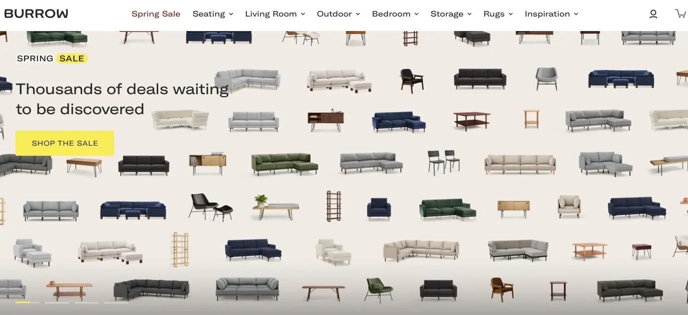
This furniture retailer lets their products speak for themselves. Burrow leverages warm lifestyle photos to give their customers a visual of how their furniture will look in their homes. The modular furniture store offers user-friendly navigation and a responsive digital experience. Customers can shop by room and easily add customization on each product page.
Their design showcases the ease of product assembly and eliminates the usual hassle of furniture shopping. With bundles, tiers and cart discounts, customers can delay orders during checkout.
Solo Stove.
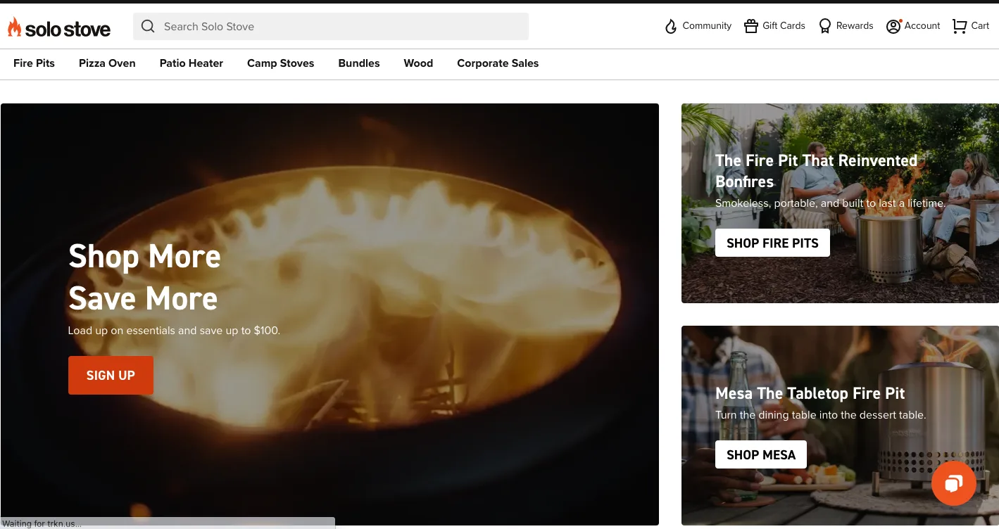
Solo Stove’s website proves a minimalist design can create a great ecommerce website. Their brand transports you to a past moment when you and your family sat by the fire pit, creating lasting memories.
The user experience drives Solo Stove’s content and imagery. From lifestyle hero animation, customer reviews, user-generated photos and how-to videos to FAQs on product pages, free shipping, flexible payment options and detailed product descriptions.
Customers can also control the return process by generating custom shipping labels and QR codes for post-office drop-offs.
Skullcandy.
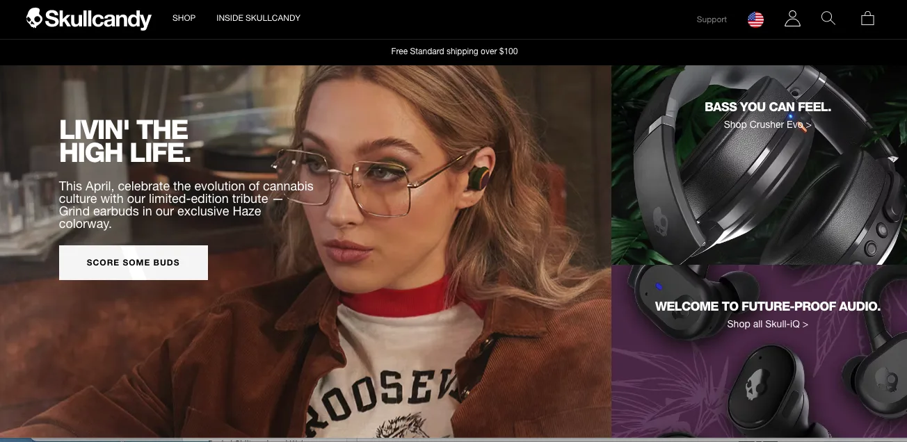
Skullcandy understands its brand and uses fashion-forward photography and product styling to evoke emotion. Vibrant colors juxtaposed against a black background add a beat of sophistication that speaks to their innovative, cutting-edge technology and reputation as a global leader in mobile audio.
Skullcandy has a solid grasp of its audience, the youthful music lovers who live for exploration. Thrill-seeking videos and uptempo rock music create an immersive experience that makes customers want to become trendsetters with the latest headphones.
Leveraging BigCommerce API app integration, customers can shop for products on Facebook and Instagram, significantly increasing earnings. In the first quarter of 2021, Skullcandy saw a 146% growth in revenue.
Saddleback Leather.
Cast Study: Saddleback Leather
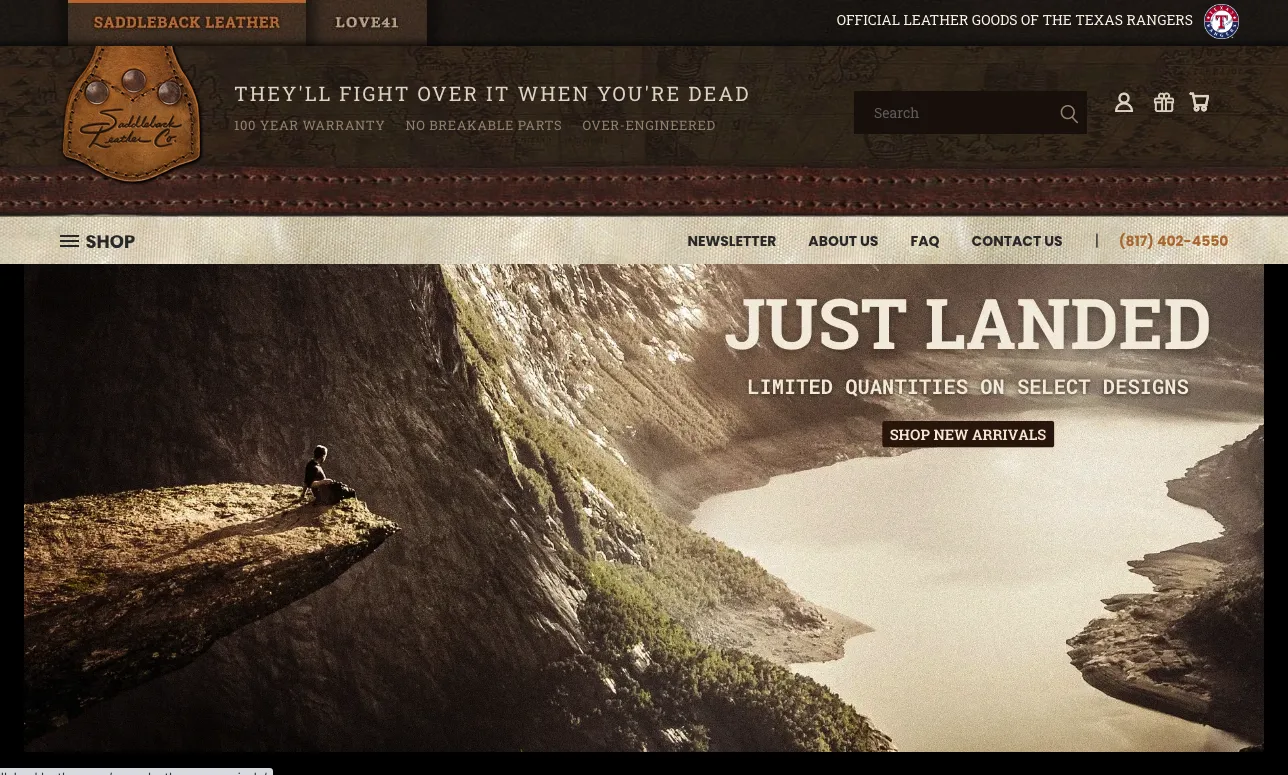
Saddleback Leather’s website is timeless. But why wouldn’t it be? They aren’t producing products; they’re selling heirlooms.
What started as one leather bag has developed into a catalog of quality products. The dynamic design is a nice balance of information and style. Website content articulates the brand’s open, adventurous and purpose-driven attitude.
Identifying as “a people business,” Saddleback’s website is transparent, welcoming customers into the lives of the company founders and fellow shoppers. Instead of buying from a big, well-oiled corporation, customers feel they’re buying from people who care about their products and shoppers.
Customers can access leather education videos, product demos and a blog with content on leather maintenance and Saddleback’s unconventional mission and values.
Even with the launch of their women’s line, Love41, and expansion from bags to briefcases, luggage and accessories, Saddleback’s product arrangement remains coherent and convenient.
Larq.
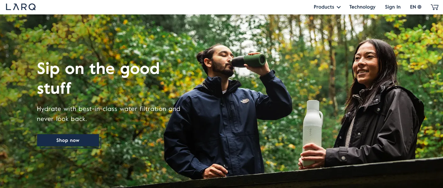
Larq’s homepage guides customers to the essential store elements. Their design integrates innovative product technology with inspirational visuals. High-resolution product images display at the top of the page, and buttons and links highlight their diverse product line and features.
The multiple payment options and currencies, headless commerce and frictionless integration with third-party logistics (3PL) help Larq get plastic-free, reusable water bottles into the hands of their global audience.
In prioritizing a simple checkout process and launching their multi-regional storefronts under one domain, Larq’s average year-over-year revenue increased by 400%.
Advantages of Using BigCommerce for Designing a Site
You no longer need to choose aesthetics over utility.
BigCommerce gives you the templates and tools to build a beautiful online store with responsive themes and images for mobile. Backed by SEO, security and functionality, our ecommerce platform equips your store with a robust foundation to increase sales, site performance and engagement.
Customization opportunities.
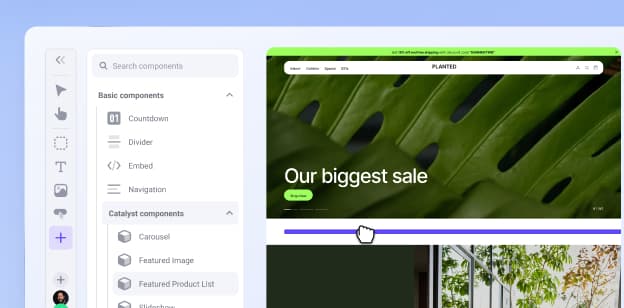
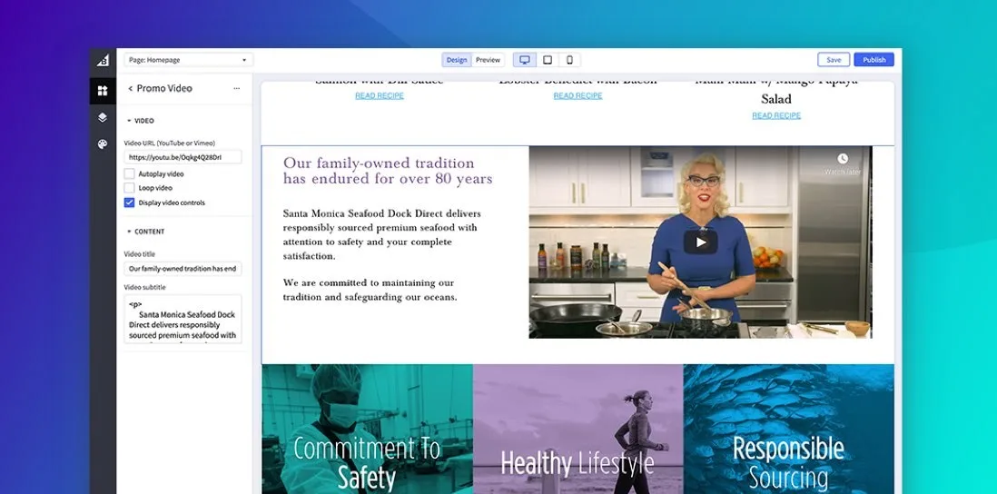
Your site’s appearance is in your hands. Recruit the expertise of our professional website designers or create an original theme using the BigCommerce drag-and-drop website builder tool. Edit themes to produce landing pages in half the time and cost to develop a design from scratch.
Customize features, site domain name, logo, colors and fonts for a personalized shopping experience that distinguishes your brand. Adjust site text for readability and accessibility to accommodate customers with varying sight and hearing impairments.
The more you customize your store as an ecommerce website builder, the more you can make it unique, gaining an advantage over your competitors.
Ease of use.
Convert and captivate your audience without using code. BigCommerce makes it easy for beginners to design and build their ecommerce website with minimum technical knowledge and skills. Get a visually attractive, interactive design in only a few clicks.
BigCommerce scales with your store, so you can manage your design as priorities shift. Insert and remove pages without the help of developers and customize your navigation sequence to accommodate changes in product categories and filters.
Sales and payment processing.
BigCommerce can integrate with popular payment apps, including PayPal, Square, Stripe and more. The streamlined checkout on all devices effortlessly moves customers through your sales funnel.
BigCommerce hosting also provides a fast page load time to support a smooth checkout process. Since 53% of users leave a page that takes longer than three seconds to load, the quick site speed improves conversions and sales.
Website performance and security.
By leveraging the power of Google Cloud Platform, BigCommerce delivers multi-layered security, enhanced bandwidth and unmatched loading speed for glitch-free engagement.
Averaging uptime of more than 99.99%, you can rest assured that your store won’t crash or encounter frequent hosting errors that hinder site performance.
Replatforming Guide: A Roadmap for Migrating Your Ecommerce Store
Make your ecommerce replatforming project a success with our step-by-step guide filled with best practices from enterprise migration experts.
The Final Word
Without an efficient ecommerce website, you could miss an opportunity to increase product awareness and elevate your digital brand. An optimized design improves product visibility, increases store traffic and provides a personalized user experience.
Now you can build an ecommerce store that merges the key elements of content, commerce and convenience without technical expertise.
